Environmental Graphic Necessary for Indoors

The environment around us, the homes in which we live, all have an urgent need to establish the right relationships of forms, colors, as well as careful organization based on visual principles.
Through graphic language, human beings can speak to their surroundings and communicate with others. Using urban graphics in the interior of houses and their outer space, ie alleys, streets and green space around, in decorating and beautifying the offices of institutions and public places such as parks, exhibitions, shops and… for all people at all levels of society and It is effective and needed at any age and plays an important role in the appropriate and desirable environmental structure. A suitable environment is a space in which human beings can grow and prosper without the unwanted pressures of life.
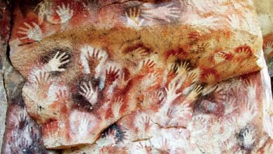
Graphic and urban advertising is one of the oldest and purest forms of communication. From the first painting on the walls of the caves to the latest video projection and Video Walls.
Urban advertising is one of the oldest advertising tools to introduce services and goods, which includes a variety of posters, billboards, bus body design, cars, stands and advertising volumes.
Urban and environmental advertising is considered an economic and commercial category in the world and, like other professional activities in the West, has its own characteristics. Urban advertising and graphics today provide the most service to economic trusts and cartels. The visual information given to citizens by graphic designers should have aesthetic and engaging aspects as well as the necessary impact. In the form of billboards, they can convey cultural, political, social, and economic information to the community, as well as beautify the city. Thus, in the present world, graphic art is required to serve part of its activities in the service of architecture, environment and urban space, and to participate in organizing and creating facilities and beautifying urban space.
In the following, new examples of urban advertising and environmental graphic projects are introduced. As can be seen, urban graphics and advertising is a science in which how to use a variety of forms, colors, roles and images in a skillful, principled and planned way to make relationships and communications easier and simpler. Traffic as well as completing the beauties of the city’s public environment have been discussed and examined. Obviously, if the measures are not taken by urban graphic designers in order to improve the design and the principle of visual elements in the urban space, the environment of citizens will become an unbearable, tense and unbalanced place. While by creating a suitable collection of forms, colors and designs, you can provide the welfare and comfort of people in the community for a better life and give a new spirit to the city.
What are environmental graphics?
In Europe and America. Application of graphics in the formation of indoor and outdoor spaces. In architecture and urban planning. They are expressed in terms such as Graphics Environmental (which is translated as graphic) or Sing Design (which can be translated as sign design) or Sinage (Sanage = marking). That if this application serves the outer spaces of the city such as streets. Squares. Public green spaces and exterior walls of buildings are called City Signs (urban or street signs or graphics). We use foreign books with beautiful examples of environmental graphics in a variety of ways, such as street signs or indoor areas. We are familiar with buildings and shops and all kinds of urban decorations.
And we see and use ugly examples and misconceptions in our area (which in most cases are not used). Sometimes we try to imitate foreign works to make our living environment more beautiful, which results in an even more miserable result. Perhaps because we do not know that the key to success in environmental design, more than anything else, is knowing and mastering the meaning of both the terms design and environment and the relationship between the two.
Since research in any field needs to be defined. The most comprehensive definition we can give for environmental graphics is as follows: Proportional and coordinated design of signs, writings and decorations in the form of (either on or in combination) three-dimensional volume (such as a sign or stand) for guidance, information And to establish any other kind of communication, while creating a beautiful and appropriate atmosphere and personality, in any kind of indoor and outdoor environment in a city.
However, in the cities of previous centuries, there were signs, panels and other forms of information or orientation, as well as a variety of sculptures and decorative forms. But the term graphics in environmental design as a specialty, like other categories and graphic activities, was discovered in the twentieth century. The reasons for the importance of this art, on the one hand, followed the repeated research that has been done since the beginning of this century on issues related to the quality of life of citizens, and on the other hand due to the growing desire of many post-modern artists to leave the environment. The galleries were closed to provide an opportunity for people to react to the atmosphere of everyday life. In this way, the way of cooperation between architects and urban planners with painters and sculptors became possible. And along with the increasing development and popularity of graphic art in this period, this art was also used by architects and urban planners as a branch of visual arts. In this way, the art of designing an environment was created with the help of signs that are both beautiful and allow people to connect with places and events.
Today, major cities around the world compete for trade and tourism, and are constantly finding more attractive signs to guide and attract visitors. At the same time, every year, many buildings and centers are built in the world that, for similar reasons, bring newer graphics. In this way, every year we see newer and more creative environmental graphics, and with technological advances in the design and construction of paintings, they intensify this novelty and creativity.
Environmental graphics (closed environments) of shops and stores
The growing importance of stores in the contemporary art world is a logical consequence of the high consumption of consumers at the end of the twentieth century, so it can be said that stores are a new phenomenon of the twentieth century.
Now that we are in the 21st century, we see that stores are leading us to time changes and giving us a clear picture of shopping.
Today, stores tell us what we are and what we do, and they are a mirror of the change in our goals and aspirations. Stores are different channels that can allow us to achieve small, scattered, and seemingly complementary dimensions.
It should be noted how economic and social structures have brought the concepts of welfare and consumerism closer together. Stores have become the center of attention and have emerged as temples in the new world of shopping, so what used to be a necessity (buying clothes, shoes and food, etc.) has now become a recreational activity and stores are a reflection. They are true to the tastes and habits of modern society.
Today, designers take into account the principles and facilities of lighting to design a store. Stores that transmit dreamlike images from the designer’s mind to the viewer and present them objectively in line with the tradition of society have now become like a theater.
In contrast to these stores, which are the giant products of contemporary society, traditional stores must use a variety of weapons to combat their growing proportions. Small stores are forced to use innovative and clever methods to deal with this new phenomenon in order to Maintain their position both in the hierarchy of trading markets and in personal communications.
Today, the buyer no longer just wants to buy a product and must have the right to choose and be free to choose. He pays to buy what he really wants and wants to get the equivalent of money, sex. In other words, they pay for the sex they really need.
Stores create a close connection between entertainment and consumption in our society. Identifying and adapting entertainment with consumption has found its place in the semantic roots of the term business and has a dual meaning that introduces the simple exchange of goods as social communication. This duality, which combines business with the social needs of man as a nature of civilization, arises from a series of architectural phenomena.
This is not unique to Western society because it also works with Asian markets. Like public spaces, stores are now integrated not only as retail markets but also as gathering places for leisure and social media activities, so the contemporary program seeks not only to match market commerce with entertainment, but also It wants to be prepared to meet the general needs of the relationship between consumption and entertainment.
Stores are completely independent in this regard and integrate all the needs of buyers in service and fun activities. Undoubtedly, this expansion does not affect the role of the shopping center without its architectural form. Architectural design now has to meet a wider range of needs.
In terms of urban performance, stores should be as easily accessible as public spaces and, as in the past, with sales areas such as squares and shops in the main city and village centers, located in the city center. The shape of the store chain cooperates with formulas, systems, and based on sales and business studies, and always contains magical codes that are made of shapes, colors, and symbols that distinguish semiotics and immerse interior and exterior design in architectural semiotics. .
In order to successfully build a public space that has specific chain shapes and at the same time is permeable and flexible, two positions must be considered:
1- Stores should be appropriate to their surroundings.
2- Each space must be interpreted and justified according to the unity of the chain.
The role of environmental graphics in society:
What works in environmental graphics depends on the type of space, its dimensions and needs, and it is not really possible to say that all environments need a sign, pictogram, or board equally, however, all environmental graphic systems have four general uses:
1- Recognizing the identity of an area or a place or building as an urban symbol.
2- Guiding people to achieve their desired goals through orientation.
3- Informing people about places, activities and events of which they are unaware.
4- Decorating and beautifying the environment, which at the same time can have three previous functions.
Undoubtedly, a human being who lives in a beautiful environment with an identity. He will be a human being with a spirit and can consider himself an entity with an identity. It is not really a slogan that a suitable environment can lead to a better social and psychological life, more energy, social progress and even national unity. Which, unfortunately, is not the case in Iran. Maybe because they think they have to pay to beautify the environment. From the costs they now pay for other (and less useful) purposes. It will be more, that such a notion is certainly wrong. In any case, we in Tehran do not live in an environment with identity and comprehensibility, and we certainly do not know the most important factor in the lack of national spirit and public anonymity in our city.
Problems faced by environmental graphic designers
One of the problems that designers (especially designers working for outdoor environments in the city) face all over the world is that the graphic design process does not take place at the same time as the construction of the area. Or the design is never done at the same time for the various components of the area. In such cases, it is very difficult to coordinate the details completely with the whole project.
Another problem that exists in many parts of the world (for example, in Iran) is the lack of proper planning and funding for environmental graphics. At the same time, with thought and creativity, and by adopting the right execution method, the most beautiful designs can be created with the cheapest materials. Another major problem facing designers around the world (again, especially in the field of urban graphics) is the constraints imposed on the design. For example, graphic designers still use words and arrows uniformly in their work. And the reason is that they are understandable to the people. But no research has shown that these stereotypical methods, which are originally imposed on graphic artists by the government, consulting engineers, and urban designers, are the best way to navigate.
Engineers usually show a lot of evidence that standard methods are more accurate. But designers have to work hard to persuade planning managers, even if it takes as long as it takes to implement the plan. But the biggest problem environmental graphic designers face is that most people find the concept of symbols and visual cues difficult, and designers almost always make design decisions based on personal experience and with false assumptions of public awareness. This is why many designers use text instead of signs, which is a denial of the purpose and neglect of the issue of international communication, and in this case it is necessary for designers to evaluate their symbols and images to see that people understand them. Or not, to ensure the capability and clarity of their symptoms through public testing and consultation with each other.
Finding the right body in a real environment is a complex process, but the result can be quite valuable.
An understandable navigation, information and identification system impresses visitors and gives them a sense of order and comfort. Designing environmental signs, or having too many problems, can affect people more than any other graphic project.
To achieve this goal, environmental graphics must be effective. Any decoration and advertising in this field that has only the aspect of appearance will not last more than a few days. In Iran, many examples can be given in this field. Cinemas, cafes or shops or even cultural centers that start with a lot of dengue and feng and due to not having a proper study in the arrangement of their environment, after a short time, the shape of the streets and squares seem disgusting. Our cities are even more miserable. So that most people avoid them. I think it’s time (or maybe it’s time) to think of a way to achieve a healthy, beautiful, and identity-based living environment in our city.
Of course, the problem of environmental design in Iran is not just the lack of good paintings or beautiful makeup. The main problem is that urban planning or urban development in the last 60 years has been done without observing the principles and rules of aesthetics, and the interior or exterior architecture of most buildings or places is proportional and inconsistent with the urban environment or other buildings. While in the architecture and urban planning of Iranian cities in the past centuries or Tehran in the early century, these aesthetic principles have been observed. The inconsistency and confusion we see in the streets and buildings of Tehran is such that the signs and signs (even if they are understandable and beautifully designed that they are not) not only do not cover the ugliness and ugliness, but also the crowds and complexity. They also add environment. Like a wounded body and a disease that needs an ointment, but we cover it with colorful clothes. If environmental design groups are formed in Iran. Their job is not to design the right sign in the first place. Rather, it is the removal of all appearances and additions such as signs, paintings, colors and additional and heterogeneous equipment, in order to reach the basis of environmental architecture. Recognize the problems of ugly bodies on walls, doors and windows, sidewalks, etc., and then stress new clothes, which are paintings and decorations with identity and solutions.
Types of environmental graphics and examples in the world
In terms of graphic display, the environment can be divided into two categories:
1- Two-dimensional or flat visual graphics and pictograms
2- Three-dimensional or volumetric environmental graphics such as POP Shapes and theatrical volumes such as sculptures that can be seen in the corners of the city.
1- Flat or two-dimensional environmental graphics:
Pictograms, symbols, visual cues, etc. are usually displayed flat or two-dimensional. The advantage of this type of messaging is that instead of the graphic artist having to express his meaning in several languages and inevitably in very large boards.
It can be expressed with simple signs that not only all nationalities can understand, but even illiterate people can use it.
Psychologists and social psychologists have called this type of image lightning information.
* Sources and references are available in the editorial office of Artmag.


